Scenario Card App
Scenario Card started off as a passion Kickstarter project in 3 packs of physical cards sold in Europe. It aims to help people uncover their life purpose through powerful “What-if” Scenario without a need to engage a life-coach.
Roel Vogel (Germany)
Role
UI Designer
1 month sprint
Challenge
The client has already sold 200 physical pack of cards within his circle of friends and a kickstarter campaign has already been launched. There were initial feedbacks gathered from his existing customers and these are the 2 common findings:
The price point of $20 Euros can be expensive just for a deck of cards
Customers prefer easy access to the questions compared to bringing the pack of cards everywhere they go
Findings
It was revealed that:
Customers think it will be helpful if the questions are not repeated
Customers would like to revisit and share their favourite questions
There is a confusion with the gameplay despite having an instruction card
Only 20% of the customers use the cards for self-reflection, others mainly for group setting
The price point of $20 Euros is expensive
Prefers having questions in their phone compared to bringing the cards everywhere


Product Vision & Solution
From these findings, I've identified the key business goals:
We want users to understand the impact of using the digital version of the cards
We want users to take action to spark insightful conversations within themselves and others
We want users to understand how their actions positively affect change
As a starting point, I've played the physical cards among my friends to have a first-hand experience and did market research on competitors to investigate the current offerings in the market. We take inspiration from useful features that we liked about each app.
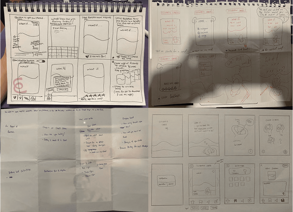
Defining the MVP & Prototyping
Based on the sketching sessions, it was revealed that there were commonalties in the product vision. We conduct a prioritisation exercise with the client and identified the following key user stories:
Easy navigation on gameplay
Ability to share on social media
Bookmark a favourite card
Journaling feature for self-reflection
Option to customize for repeated questions


User Testing Insights
On-boarding page making it intuitive
Showing instructions after on-boarding
Easy access to question cards
Misleading question button
Too many warm ups before gameplay
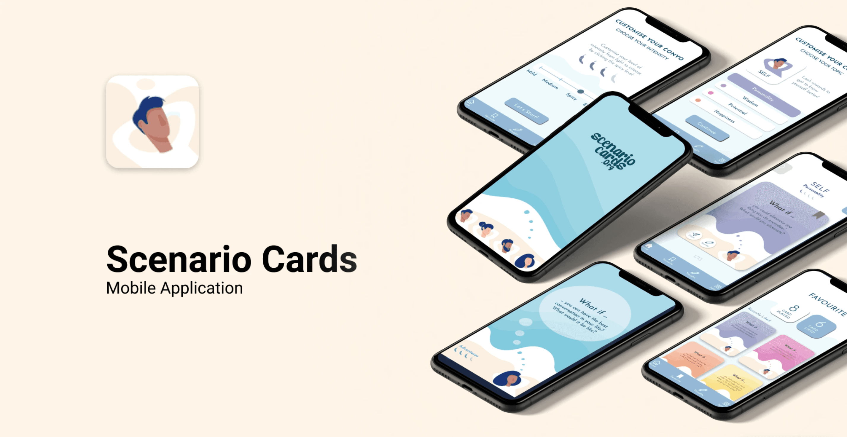
Final Prototype
Use of pastel blue colour as the key theme to evolve feeling of calmness
Use of San serif font for better viewing on mobile
Have a question at the loading screen to have a preview of what is the content inside the app


Results & Feedback
“The research prior to the app design was spot on. I loved the new insights they gathered from my top customers with regards to a digital version, and how the digital version could be an opportunity to make something new, rather than a copy of my physical product.” - Roel Vogels
Key Takeaways
Working in an early-stage startup was an extremely steep learning curve. It was an eye-opening experience that taught me a lot about being lean and knowing when and where to focus your energy and efforts. Some key takeaways from this project are:
Focus on building an MVP. In a startup, there is only so much time and effort that you can invest (especially when you’re working full time) so it’s important to focus on the features that can deliver the highest value for your users.
Don’t worry too much about the detail. Earlier in my journey, I made the mistake of worrying about the look of the UI. Taking a step back and reassessing the user flows/insights helped me to reprioritise the UX.
Focus on the problem. At the end of the day, it is about solving user’s frustrations and to keep that in mind so as to not lose sight when you’re bogged down in the day to day.