Optimizing a Corporate Intranet
Redesign and optimization of a corporate intranet to enhance usability, improve internal communication, and boost employee engagement. The project aimed to create a more interactive and user-friendly platform for employees to access company resources and collaborate effectively.

The Sprint
This work is a sample of a project made for client X in a typical sprint environment at Accenture every month. This project runs through almost 2 years with at least 17 sprints, with each sprint having different scopes, features and user stories. Sprint works on an agile methodology and it breaks into several phases such as the following;
User Story Walkthrough By Business Analyst (BA)
Draft Alignment To Client UX Team
Review Sessions (2 Reviews) With Product Owners (PO) & Users
UI Sign Off By PO
Handover To Developers
Sample User Stories For Notification Preferences
In a given sprint of the month, there can be 20 to 30 user stories. Due to NDA, I can assess some user stories without compromising the client’s information.
User Stories
As an individual user, I’d like to see an overview of my notification preferences after logging in, and only the preferences I have set.
Reference:
As a first-time individual user, my notification preferences may show me unavailable which allows me to set my preferences.
As an individual user, I may engage an Audit Firm to handle my documents on my behalf. The audit firm will be able to see the same preferences as I am.
As an individual user, I have 3 categories (documentation) of notification preferences, which my preferences will show me the different types of scenarios I may have. Note: This user story has several scenarios based on the preferences. For this case study, I will showcase only 6 scenarios that I deemed most common use cases.
User Flow
Both Individual and client’s representative (Audit Firm)

Key Users
2 key users use this feature. The individual user and the individual’s agent.
The Users
‣ Individual (Main user)
‣ Client’s Representative (Audit Firm)
The Login Section

Individual (Main User): The main user uses Login Type 1
Client’s Representative (Audit Firm): Client’s representative uses Login Type 2
The channel between the login and login page is confidential. The above low-fidelity preview shows what users with various notification preferences will see upon logging in. Let's begin with the default scenario:
Scenario 1 (Default)
Desktop (L) Size vs Mobile (S) Size


This is the default (card) scenario whereby the user has all preferences type set in all 3 categories. In a given situation where the user logs in, the flow will be as follows;
Desktop (L) Size - Overview Page

Scenario 2 - Unavailable Preferences
This scenario caters to the user story whereby the user’s preference is unavailable
Desktop (L) Size vs Mobile (S) Size
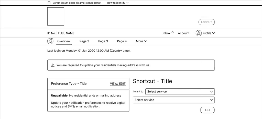
If user preferences are unavailable, there's a concern that some users may not realize the need to update their residential or mailing address, creating a potential gap.
After assessing the design system, the announcement box component addresses this concern by placing it at the top with the message, "You are required to update your residential/mailing address with us.”
This follows HCI standards of helping user recognise and diagnose issues, and flexibility
Why announcement box?
Most features utilize the announcement box to prompt users for updates or actions, though these are generally optional, not mandatory.
Though the hypertext "residential/mailing address" and the "View/Edit" button seemingly lead to the same page, users can choose either the hypertext in the announcement box or the button in the card for flexibility.
Scenario 3 - Client's Representative
This scenario caters to the user story of a client’s representative logging in on behalf of the individual user.
Desktop (L) Size vs Mobile (S) Size
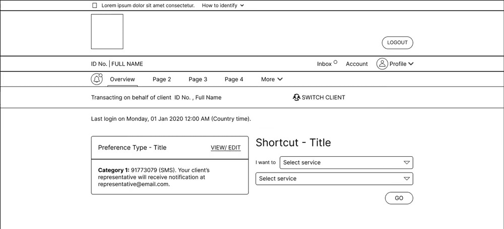
In this scenario, the client’s representative will be able to see the same preference as the client (individual user) as well.
The “Switch Client” top bar is a common component in the design systems and can only be used to display when there is a 3rd party representative logging in the system on behalf of a client.
Why Switch Client?
While the common use case of this feature aims for individual users to use the system and this is the main overview section, there can be a situation whereby the individual user engaged an audit firm to handle the system.
Thus, the switch client is created as a common component and used across all features whenever necessary.
Complying with HCI standards
Few of the interactions were proposed, and aligned with Nielson’s Heuristics:
‣ User control & Freedom
‣ Consistency & Standards
‣ Recognise, Diagnose and Recover
Conclusion
When converting high-fidelity wireframes to low-fidelity, it's crucial to censor confidential info and block logos to maintain client confidentiality. However, consolidating this while organizing my thought process chronologically can be challenging. To ensure coherence, I must align user stories with the intended users and connect them with the wireframes.